SPSS, part 6: Regressions

Regression can be used to predict variables:

  • IV: x axis (predictor)
  • DV: y axis (criterion / outcome)

Analyze -> Regression -> Linear

  •  move variables into corresponding boxes
  • ensure “Method = Enter”
  • in SPSS
    • raw equation: DV = (B [slope] x IV) + constant [intercept]
    • standardised: ZDV = β [beta] x ZIV (standardised variables to Z scores)
    • standardised is a better indicator of strength and measure independent of units
  • in multiple regression (more than one IV) β measures unique effect of IV – no shared variance
  • look in last table for β value (the correlation) and B and constant
  • look in ‘model summary’ table for R2 (proportion of variance explained by all IVs)
  • look in ‘ANOVA’ table for F value (to check if R2 predicts DV better than chance – if F is significant then R2 is better)
  • R2: need to multiply by 100 to get %


SPSS, part 5: Correlations

Bivariate = linear relationship between TWO variables.

Pearson correlation = r = parametric, assume normal distribution (more powerful)

Spearman’s = ρ (rho) = nonparametric ranked data

Analyze -> Correlations -> Bivariate

  • Move variables into box on right
  • Tick “Pearson” or “Spearman”
  • In output look at the 2 numbers that are the same and significant.

Scattergram: to check it’s linear

Graphs -> Legacy Dialogs -> Scatter/Dot

  • Click “Simple Scatter” and move the variables to the axes (it doesn’t matter which one goes where)
  • To get line of best fit, right-click -> edit content -> Elements -> fit line at total

Phi and Cramer’s V = only look at phi (φ) = both variables dichotomous (2 categories)

Analyze -> Descriptive Stats -> Crosstabs

  • Click “Stats” and choose “Phi and Cramer’s V”
  • Click “Cells” and tick “Observed” and “expected”
  • Check how variables are coded because a negative correlation could mean a positive relationship if coded non-intuitively (low numbers = high levels of variable).

SPSS, part 4: Graphs and tables

Chart Builder – doesn’t calculate mean scores for ordinal variables, so you have to change “measure” to “scale”, but it is easier to use quickly.

Graphs -> Legacy Dialogs -> (choose graph)

Simple Bar Chart: tick “summaries of separate variables”

  • Right-click on chart in output, click “Edit content”
  • Can add title (above the chart), footer (below the chart), and change pattern of bars by clicking properties -> double-clicking on the bar -> “fill and border”

Clustered Bar Chart: tick “summaries of groups of cases”

  • Tick what the bars represent (eg mean) and put in the variable
  • Move that variable to “Category axis”
  • Move the variable you want to split the file by to “Define clusters by”

Multiple Line Graph: tick “summaries for groups of cases”

  • Tick what the lines represent (N for frequency/mean) and put in the variable (if mean)
  • Move the variable to “Category axis”
  • Move the variable you want to split the file by to “Define lines by”
  • Can edit in output through right-clicking

Analyze -> Table -> Custom Tables

If trying to find mean of categorical variables, need to change measure to “Scale” in variable view.

  • Move categorical variables to left (rows)
  • Move variables you want to split the file by to top (columns)
  • Click variable on left -> click “Summary stats” at bottom left
  • Change Format to “nnnn” and Decimals to “2”
  • To add SD or anything else: “Summary stats” -> Move SD from “Statistics” box to box on the right
  • Same with cumulative %: Move “Column %”
  • To add Total: Click on the variable you want the total for -> Click “Categories and Totals” at bottom left -> Tick “Total” on right

Categorical Tables: frequencies, so change measure back to “ordinal”

  • Need to use custom tables when splitting files by TWO variables.

Pivot Tables: Put the second splitting variable into the “Layers” box on the right.

  • Can move things around by double-clicking on the table in the output.

SPSS, part 3: Frequencies

% frequencies may look big, but they depend on the number of participants, so always look at the normal frequency to compare.

Analyze -> Descriptive Stats -> Frequencies

  • move variables into box on right
  • click “Statistics” to choose only the descriptives and percentiles you want along with the frequencies
  • click “Charts” to choose histograms (continuous variables) or bar charts (categorical variables)
  • you can split the file beforehand to look at (e.g.) gender separately

To get box-plots you have to use Analyze -> Descriptive Stats -> Explore

  • put variables in the “Dependent List”
  • put variable you want to split file by in “Factor List”
  • click “Plots” to choose histogram too, and tick “Both” at bottom

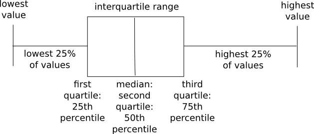
Box-plots

  • use mainly to compare the max and min values of groups
  • longer horizontal line = more variation in scores (range is bigger)
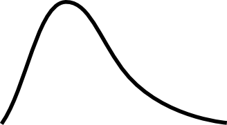
  • box-pos-skew = positive skew = skew_pos
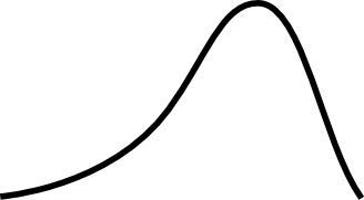
  • box-neg-skew = negative skew = skew_neg
  • can compare medians:

box-plot

SPSS, part 2: Descriptive stats

Descriptive stats

  • distribution (skew, kurtosis)
  • central tendency (mean, median mode)
  • dispersion (SD, variance, range)

Analyze -> Descriptive Stats -> Descriptives

  • move variables into box on right
  • click “Options” and choose the descriptives that you want
  • click “OK”
  • you can split the file beforehand to look at (eg) gender separately

Skew

  • may affect analyses because we assume normality
  • positive number = skew_pos
  • negative number = skew_neg
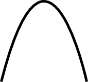
  • 0 = normal distribution

Kurtosis

  • no impact on results
  • positive number = leptokurtic kurt_pos (scores clustered tight)
  • negative number = platycurtic kurt_neg (scores not clustered)
  • 0 = mesokurtic (normal distribution)

SPSS, part 1: Define the variables

Define the variables – indicate the type of data, and whether the values represent something more than numbers.

  • Data view = actual data: scores, ratings, gender …
    • variables in columns (participants are across rows, variable is each column
  • Variable view = shows info about variables: names, types …
    • no spaces or punctuation in variable names
    • variables in rows (each variable is a row)
    • numeric variable:
      • width = number of digits (eg 3)
      • decimals = number of decimal places (eg 0)
    • SNO = subject number
    • … = opens further window for more options
    • Labels = as long as you want, with spaces and punctuation (purely for your own reference)
    • Values = labelling value
      • purely numeric = no label
      • eg Gender = need to label: 1=Male, 2=Female and width = 1

Recoding variables: eg want to reverse scale: make 1=happy into 1=unhappy

  • Transform -> Recode into Different Variables
  • Move variable into box on right
  • Rename
  • Re-label -> click “Change”
  • Old and new values -> change 1 to 5, 2 to 4, 3 to 3 …

Computing variables: eg want to add scores of two variables together to make a completely new variable

  • Transform -> Compute Variable
  • Move variable 1 into slot on right, click +, move variable 2
  • Name new variable in “Target Variable” box
  • Type + Label -> label new variable

Listing data: eg want only to see data of 3 variables and top 10 participants

  • Analyze -> Reports -> Case Summaries
  • Move variables into box on right
  • Tick “Display cases”
  • Tick “Limit cases to first” -> write “10”
  • To save output: save to same name as spreadsheet

Split file (to order data by groups): eg if you want to obtain separate descriptives for each gender

  • Data -> Split File
  • Tick “Organize output by groups”
  • Move variable to box on right
  • To switch off: Tick “Analyse all cases, do not create groups”

LaTex Template for Psychology articles

This is how I write my psychological research reports in a quick and simple way (well, it is once you get used to it!). These are templates of how they would look. I use LaTex – a free and open-source software program. It’s really handy, not only because it’s free, but because it will format the articles automatically with an apa6 package, so there’s no need to worry about where exactly to put the full stop in the reference, for example! LaTex will also only put references in the bibliography that you have cited in the text, so there’s no need to keep checking that you have the same number of references as you have citations. First, take a look at the .tex document – you can open it in any text-editor.

LaTex format looks very overwhelming and confusing to begin with, especially if you have never seen anything other than a Word document before now! Have a look and see whether you can find actual full sentences – these will be the bits of text that can actually be seen in the output document (in pdf format – see below). All the other bits are commands to let you know in which way the document will be formatted (the lines preceded by # are comments to help you understand what the commands actually do).

Now look at the BibTex (.bib) file – again, you can open it in a text editor. This is where all the references are kept so that you always have a database of what you have found. You can even write notes attached to each reference, so you know what they were about. This is a really easy way to create the bibliography because all you do is type in the details of each article and then BibTex automatically formats them.

Lastly, look at the output pdf. This is how the final document looks once it is compiled. It is much tidier-looking than a Word document and is formatted for you so (so that you don’t have to click through multiple buttons to get the look you need!).

Although this may look very different and more complicated than what you usually use, I believe that it saves time in the long run. It takes some trial-and-error in the beginning, but is worth it. It is also important to note that when you’re having difficulties, for example, if you need to know what command to use to change the format a little, there is a great deal of help online.

Lois, out.