SPSS, part 6: Regressions

Regression can be used to predict variables:

  • IV: x axis (predictor)
  • DV: y axis (criterion / outcome)

Analyze -> Regression -> Linear

  •  move variables into corresponding boxes
  • ensure “Method = Enter”
  • in SPSS
    • raw equation: DV = (B [slope] x IV) + constant [intercept]
    • standardised: ZDV = β [beta] x ZIV (standardised variables to Z scores)
    • standardised is a better indicator of strength and measure independent of units
  • in multiple regression (more than one IV) β measures unique effect of IV – no shared variance
  • look in last table for β value (the correlation) and B and constant
  • look in ‘model summary’ table for R2 (proportion of variance explained by all IVs)
  • look in ‘ANOVA’ table for F value (to check if R2 predicts DV better than chance – if F is significant then R2 is better)
  • R2: need to multiply by 100 to get %


SPSS, part 5: Correlations

Bivariate = linear relationship between TWO variables.

Pearson correlation = r = parametric, assume normal distribution (more powerful)

Spearman’s = ρ (rho) = nonparametric ranked data

Analyze -> Correlations -> Bivariate

  • Move variables into box on right
  • Tick “Pearson” or “Spearman”
  • In output look at the 2 numbers that are the same and significant.

Scattergram: to check it’s linear

Graphs -> Legacy Dialogs -> Scatter/Dot

  • Click “Simple Scatter” and move the variables to the axes (it doesn’t matter which one goes where)
  • To get line of best fit, right-click -> edit content -> Elements -> fit line at total

Phi and Cramer’s V = only look at phi (φ) = both variables dichotomous (2 categories)

Analyze -> Descriptive Stats -> Crosstabs

  • Click “Stats” and choose “Phi and Cramer’s V”
  • Click “Cells” and tick “Observed” and “expected”
  • Check how variables are coded because a negative correlation could mean a positive relationship if coded non-intuitively (low numbers = high levels of variable).

SPSS, part 4: Graphs and tables

Chart Builder – doesn’t calculate mean scores for ordinal variables, so you have to change “measure” to “scale”, but it is easier to use quickly.

Graphs -> Legacy Dialogs -> (choose graph)

Simple Bar Chart: tick “summaries of separate variables”

  • Right-click on chart in output, click “Edit content”
  • Can add title (above the chart), footer (below the chart), and change pattern of bars by clicking properties -> double-clicking on the bar -> “fill and border”

Clustered Bar Chart: tick “summaries of groups of cases”

  • Tick what the bars represent (eg mean) and put in the variable
  • Move that variable to “Category axis”
  • Move the variable you want to split the file by to “Define clusters by”

Multiple Line Graph: tick “summaries for groups of cases”

  • Tick what the lines represent (N for frequency/mean) and put in the variable (if mean)
  • Move the variable to “Category axis”
  • Move the variable you want to split the file by to “Define lines by”
  • Can edit in output through right-clicking

Analyze -> Table -> Custom Tables

If trying to find mean of categorical variables, need to change measure to “Scale” in variable view.

  • Move categorical variables to left (rows)
  • Move variables you want to split the file by to top (columns)
  • Click variable on left -> click “Summary stats” at bottom left
  • Change Format to “nnnn” and Decimals to “2”
  • To add SD or anything else: “Summary stats” -> Move SD from “Statistics” box to box on the right
  • Same with cumulative %: Move “Column %”
  • To add Total: Click on the variable you want the total for -> Click “Categories and Totals” at bottom left -> Tick “Total” on right

Categorical Tables: frequencies, so change measure back to “ordinal”

  • Need to use custom tables when splitting files by TWO variables.

Pivot Tables: Put the second splitting variable into the “Layers” box on the right.

  • Can move things around by double-clicking on the table in the output.
SPSS, part 3: Frequencies

% frequencies may look big, but they depend on the number of participants, so always look at the normal frequency to compare.

Analyze -> Descriptive Stats -> Frequencies

  • move variables into box on right
  • click “Statistics” to choose only the descriptives and percentiles you want along with the frequencies
  • click “Charts” to choose histograms (continuous variables) or bar charts (categorical variables)
  • you can split the file beforehand to look at (e.g.) gender separately

To get box-plots you have to use Analyze -> Descriptive Stats -> Explore

  • put variables in the “Dependent List”
  • put variable you want to split file by in “Factor List”
  • click “Plots” to choose histogram too, and tick “Both” at bottom

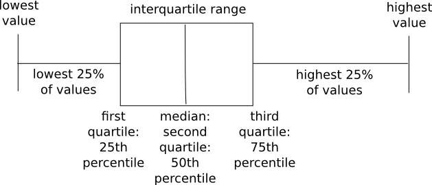
Box-plots

  • use mainly to compare the max and min values of groups
  • longer horizontal line = more variation in scores (range is bigger)
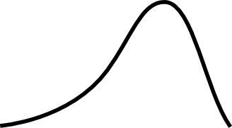
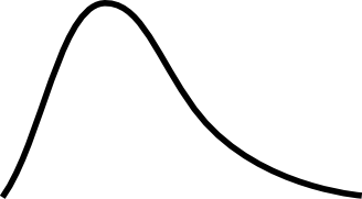
  • box-pos-skew = positive skew = skew_pos
  • box-neg-skew = negative skew = skew_neg
  • can compare medians:

box-plot

SPSS, part 2: Descriptive stats

Descriptive stats

  • distribution (skew, kurtosis)
  • central tendency (mean, median mode)
  • dispersion (SD, variance, range)

Analyze -> Descriptive Stats -> Descriptives

  • move variables into box on right
  • click “Options” and choose the descriptives that you want
  • click “OK”
  • you can split the file beforehand to look at (eg) gender separately

Skew

  • may affect analyses because we assume normality
  • positive number = skew_pos
  • negative number = skew_neg
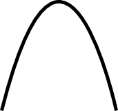
  • 0 = normal distribution

Kurtosis

  • no impact on results
  • positive number = leptokurtic kurt_pos (scores clustered tight)
  • negative number = platycurtic kurt_neg (scores not clustered)
  • 0 = mesokurtic (normal distribution)

SPSS, part 1: Define the variables

Define the variables – indicate the type of data, and whether the values represent something more than numbers.

  • Data view = actual data: scores, ratings, gender …
    • variables in columns (participants are across rows, variable is each column
  • Variable view = shows info about variables: names, types …
    • no spaces or punctuation in variable names
    • variables in rows (each variable is a row)
    • numeric variable:
      • width = number of digits (eg 3)
      • decimals = number of decimal places (eg 0)
    • SNO = subject number
    • … = opens further window for more options
    • Labels = as long as you want, with spaces and punctuation (purely for your own reference)
    • Values = labelling value
      • purely numeric = no label
      • eg Gender = need to label: 1=Male, 2=Female and width = 1

Recoding variables: eg want to reverse scale: make 1=happy into 1=unhappy

  • Transform -> Recode into Different Variables
  • Move variable into box on right
  • Rename
  • Re-label -> click “Change”
  • Old and new values -> change 1 to 5, 2 to 4, 3 to 3 …

Computing variables: eg want to add scores of two variables together to make a completely new variable

  • Transform -> Compute Variable
  • Move variable 1 into slot on right, click +, move variable 2
  • Name new variable in “Target Variable” box
  • Type + Label -> label new variable

Listing data: eg want only to see data of 3 variables and top 10 participants

  • Analyze -> Reports -> Case Summaries
  • Move variables into box on right
  • Tick “Display cases”
  • Tick “Limit cases to first” -> write “10”
  • To save output: save to same name as spreadsheet

Split file (to order data by groups): eg if you want to obtain separate descriptives for each gender

  • Data -> Split File
  • Tick “Organize output by groups”
  • Move variable to box on right
  • To switch off: Tick “Analyse all cases, do not create groups”